• OVERVIEW
  • UX/UI
  • DESIGN/ILLUSTRATION
  • INFOGRAPHICS
  • 3D/animation
  • About
  • Contact
Chris Dobrowolski
  • OVERVIEW
  • UX/UI
  • DESIGN/ILLUSTRATION
  • INFOGRAPHICS
  • 3D/animation
  • About
  • Contact

IHRDC infographic

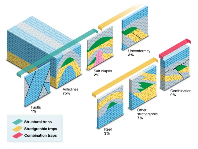
This infographic visually represents the percentages of geological "traps," and also groups the traps into three categories..

Formation comparison.jpg

Powered by Squarespace.