Pan Am Case Study
Pan Am UX case study. Capstone project for UX Design bootcamp, DesignLab, S.F.
Business requirements:
1) Increase bundling of hotel reservations and car rentals.
2) Make use of PanAm’s legacy of service
Empathy:
Interview recent flyers and frequent flyers.
Create persona(s) and empathy diagram.
Research plan:
1) Competitive analysis to see if it is possible to save money by bundling hotel reservations and car rentals with airfare on major airlines.
2) Discovery interviews with recent and frequent flyers to discover pain points. Ask about flyers’ interest in bundling hotel reservations or car rentals.
3) List insights and prioritize discovered user needs.
Problem definition:
Create POV statements
_____________________________________
Insights
I discovered that users were hostile to websites cluttered with promo boxes. Most users simply wanted to cash in their frequent flyer miles, book their flight and leave the site.
Users were unanimous in believing that bundling with airlines would not save them money.
At best, users were indifferent to PanAm’s “legacy of service.”
I did research on bundling and discovered that airlines make agreements with individual hotels and car rental agencies to buy in volume over a period of time. This enables them to get lower rates at specific hotels.
_____________________________________
Ideate/Design
Ideation and design were interwoven in this case. The first step was the easiest, creating a clear path to booking a flight.
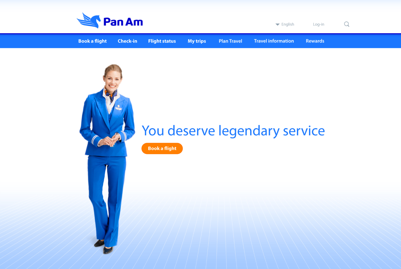
I created user flows and a site map. I began sketching, simplifying the home page with a bold CTA. I added a flight attendant and a headline alluding to PanAm’s legacy of great service (“You deserve legendary service”) in a gentle way to meet the second requirement, since users were skeptical of a more bold claim.
At the bottom of each page I added testimonials from users stating directly that PanAm saved them money in comparison to online travel agencies (OTAs). I also added a quote from the Huffington Post stating that airline bundles can be cheaper than using OTAs.
I added links to a page that explained how airlines accomplish this, for interested customers. These quotes were intended to gently break down customer resistance to bundling without interfering with the booking process.
I also spent a lot of time on the chart comparing fares and flight times using graphical elements. User testing showed it to be very effective.
As I was designing I realized that while the customer was booking his flight, the software could be searching PanAm-affiliated rental agencies and hotels at the destination for prices, and also prices from OTAs at these agencies and hotels.
This information could then be presented to the customer after checkout, such as, renting a Ford Escort through PanAm would be $10 less than booking through Expedia. The user would have little incentive to shop elsewhere.
Of the 100 designs that my mentor reviewed, he said that mine was the best he had seen.
_____________________________________
Design
1) Task flows
2) Sketching
3) Wireframes
4) Pages
5) Prototype
6) Demo video
_____________________________________
Testing
Several chart designs were tested. The final design was very successful, with one user stating, “This would save me a lot of time.


