Advisor360
Team:
I worked as a UX Visual Designer on two teams of three people. Each team was composed of a UX designer, UX Visual designer and an engineer.
Process:
2-week sprints. Many projects rolled over. The UX designer would typically create an Axure prototype based on functional requirements. We often brainstormed together. My main responsibilities were to apply existing components and styles, to conform designs to existing patterns as much as possible, and to create responsive designs.
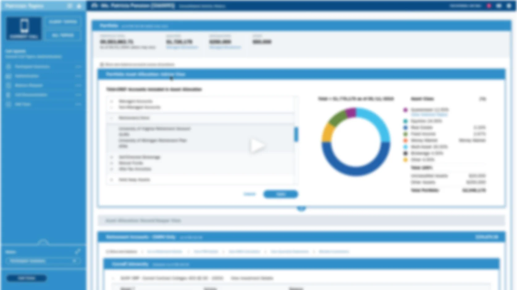
These pages are taken from the Advisor360 website and are representative of the kind of work that I did at Advisor360. I specifically worked on all of the cards shown.
One project worth highlighting is the “Business Snapshot” widget.
The purpose of the Business Snapshot widget was to provide to the advisor the ability to visually track his assets under management throughout the year. I worked with the other UX designer to create several mockups, including animations showing interaction behavior and responsive behavior. These mockups were presented to the wider design team and critiqued. After many meetings the team agreed on a final design that turned out to be difficult to develop. The chief engineer did not want to dedicate the required resources to the project. He suggested using an existing pattern in Angular that could provide the functionality that we were seeking. I worked along with the team engineer to conform the Angular design to our existing styles.
Software:
Sketch
Abstract
Animate CC
Axure
Pan Am UX case study. Capstone project for UX Design bootcamp, DesignLab, S.F.
Business requirements:
1) Increase bundling of hotel reservations and car rentals.
2) Make use of PanAm’s legacy of serviceEmpathy:Interview recent flyers and frequent flyers. Create persona(s) and empathy diagram.
Research plan:
1) Competitive analysis to see if it is possible to save money by bundling hotel reservations and car rentals with airfare on major airlines.
2) Discovery interviews with recent and frequent flyers to discover pain points. Ask about flyers’ interest in bundling hotel reservations or car rentals.
3) List insights and prioritize discovered user needs.
Problem definition:
Create POV statements
_____________________________________
Insights
I discovered that users were hostile to websites cluttered with promo boxes. Most users simply wanted to cash in their frequent flyer miles, book their flight and leave the site. Users were unanimous in believing that bundling with airlines would not save them money. At best, users were indifferent to PanAm’s “legacy of service.”I did research on bundling and discovered that airlines make agreements with individual hotels and car rental agencies to buy in volume over a period of time. This enables them to get lower rates at specific hotels. _____________________________________
Ideate/Design
Ideation and design were interwoven in this case.The first step was the easiest, creating a clear path to booking a flight. I created user flows and a site map.I began sketching, simplifying the home page with a bold CTA. I added a flight attendant and a headline alluding to PanAm’s legacy of great service (“You deserve legendary service”) in a gentle way to meet the second requirement, since users were skeptical of a more bold claim.At the bottom of each page I added testimonials from users stating directly that PanAm saved them money in comparison to online travel agencies (OTAs). I also added a quote from the Huffington Post stating that airline bundles can be cheaper than using OTAs. I added links to a page that explained how airlines accomplish this, for interested customers. These quotes were intended to gently break down customer resistance to bundling without interfering with the booking process.I also spent a lot of time on the chart comparing fares and flight times using graphical elements. User testing showed it to be very effective.As I was designing I realized that while the customer was booking his flight, the software could be searching PanAm-affiliated rental agencies and hotels at the destination for prices, and also prices from OTAs at these agencies and hotels. This information could then be presented to the customer after checkout, such as, renting a Ford Escort through PanAm would be $10 less than booking through Expedia. The user would have little incentive to shop elsewhere.Of the 100 designs that my mentor reviewed, he said that mine was the best he had seen.
_____________________________________
Design
1) Task flows
2) Sketching
3) Wireframes
4) Pages
5) Prototype
6) Demo video
_____________________________________
Testing
Several chart designs were tested. The final design was very successful, with one user stating, “This would save me a lot of time.
Images (top to bottom):
Previous software version (2.0).
TIAA UI demo animation created using Sketch and Animate CC. This demo won funding for the 3.0 project.
A full screen mockup created for the demo version.
A full screen mockup of the final design
Full screen showing menus and popovers.
Animation demo of the final design.
Two style variation mockups for TIAA.
Initial requirements:
1) Re-skin the internal advisor UI incorporating new “agenda builder” functionality.
2) Emphasize data more than labels, as experienced advisors don’t need to read labels.
Team:
Sr. Visual Designer - Myself
UX DesignerPrincipal
UX Designer
Process:
The first milestone was to present mock-ups to TIAA executives in NYC to get buy-in and funding for development. I focused on one exemplary page that contained the most data. I applied a color scheme that was similar to other internal products. Since one of the requirements was to bring data forward, I chose an accordion menu for the “agenda builder” feature rather than a fly-out, which obscured data. (see “previous design”). This initial design was accepted, so I built an animated demo which was later presented to the executives in NYC and well received. We were given funding to proceed with the project. Managers became more involved with the project adding additional requirements.
Go to “TIAA UI Demo - Part I” under the UX tab to see the first phase of this project.
While the executives were happy with the new design, I thought the colors were too intense and distracting from the data. So I created two mockups designed to highlight data.The first design is in light shades of gray. The data is black and easy to read. This was my favorite design because it met the initial requirements.In the second design I worked to make the beginning and end of containers more apparent by adding a blue background and drop shadows. This design may have made sense with a B2C product, but I judged it to be unsuitable for the advisors who wanted data to be emphasized.
View images here:
https://chrisdobrowolski.squarespace.com/ui-mock-ups/
At this point, a new requirement was added. The new requirement was to make the design as accessible as possible. The final design at bottom reflects our work on contrast ratios and other means of making the design more accessible.
Software:
SketchAdobe
Animate CC
Images
Pan Am UX project. Invision prototype (top) and case study (bottom).
Pan Am UX case study. Capstone project for UX Design bootcamp, DesignLab, S.F.
Business requirements:
1) Increase bundling of hotel reservations and car rentals.
2) Make use of PanAm’s legacy of serviceEmpathy:Interview recent flyers and frequent flyers. Create persona(s) and empathy diagram.
Research plan:
1) Competitive analysis to see if it is possible to save money by bundling hotel reservations and car rentals with airfare on major airlines.
2) Discovery interviews with recent and frequent flyers to discover pain points. Ask about flyers’ interest in bundling hotel reservations or car rentals.
3) List insights and prioritize discovered user needs.
Problem definition:
Create POV statements
_____________________________________
Insights
I discovered that users were hostile to websites cluttered with promo boxes. Most users simply wanted to cash in their frequent flyer miles, book their flight and leave the site. Users were unanimous in believing that bundling with airlines would not save them money. At best, users were indifferent to PanAm’s “legacy of service.”I did research on bundling and discovered that airlines make agreements with individual hotels and car rental agencies to buy in volume over a period of time. This enables them to get lower rates at specific hotels.
_____________________________________
Ideate/Design
Ideation and design were interwoven in this case.The first step was the easiest, creating a clear path to booking a flight. I created user flows and a site map.I began sketching, simplifying the home page with a bold CTA. I added a flight attendant and a headline alluding to PanAm’s legacy of great service (“You deserve legendary service”) in a gentle way to meet the second requirement, since users were skeptical of a more bold claim.At the bottom of each page I added testimonials from users stating directly that PanAm saved them money in comparison to online travel agencies (OTAs). I also added a quote from the Huffington Post stating that airline bundles can be cheaper than using OTAs. I added links to a page that explained how airlines accomplish this, for interested customers. These quotes were intended to gently break down customer resistance to bundling without interfering with the booking process.I also spent a lot of time on the chart comparing fares and flight times using graphical elements. User testing showed it to be very effective.As I was designing I realized that while the customer was booking his flight, the software could be searching PanAm-affiliated rental agencies and hotels at the destination for prices, and also prices from OTAs at these agencies and hotels. This information could then be presented to the customer after checkout, such as, renting a Ford Escort through PanAm would be $10 less than booking through Expedia. The user would have little incentive to shop elsewhere.Of the 100 designs that my mentor reviewed, he said that mine was the best he had seen.
_____________________________________
Design
1) Task flows
2) Sketching
3) Wireframes
4) Pages
5) Prototype
6) Demo video
_____________________________________
Testing
Several chart designs were tested. The final design was very successful, with one user stating, “This would save me a lot of time.
IPIMS eLearning images from top to bottom:
Topic page - Multi-stage, Horizontal Well Treatments
IPIMS Portal page
Sub-topic page - Hydraulic Fracturing
Sub-topic page - Plate Tectonics
Modal window
My role in the process is to create UI mockups. I also create and maintain the standards for graphics and illustrations, as well as creating 3D models, renderings and animations.
Interface and section page mock-up for CIDB Malaysia eLearning program.
The design was client-driven. Specifications included:
1) UI to incorporate CIDB corporate colors, and other vibrant colors.
2) Each section landing page was to incorporate three brightly colored safety-related icons.
To make the icons as interesting as possible, I gave them a glossy, three-dimensional treatment, and placed the icons on a dynamic, contemporary background.
(Adobe Illustrator, Photoshop)
High fidelity mockup of Blue Wave Creations mobile app created with Adobe XD and Adobe Animate.
UI mock-ups created for Tomb Raider
(Adobe Illustrator, Photoshop)
TANAP is the Turkish transnational gas pipeline project. IHRDC is contracted to deliver an eLearning program for TANAP workers.
I was tasked with designing styles for icons and diagrams for this project.
I chose to use shades of the client's blue and brown logo colors. The style is similar across icons and diagrams, providing a consistent visual experience for the users. The Xyleme-created eLearning interface also incorporates the TANAP corporate colors.
(Adobe Illustrator)
Flash animation of the fracking process for IHRDC IPIMS eLearning
(Adobe Illustrator, Animate)
Warning icons created for the TANAP eLearning project, for workers on the Trans-Turkey gas pipeline.
(Adobe Illustrator, Photoshop)
"Best of Show"
2009 Society of Technical Communications - Northeast Chapter Awards
"Wordless" user documentation for a Bose Lifestyle System. I created the graphic standards for all Bose user documentation.
Users were observed and interviewed in the Bose usability laboratory.
(Adobe Illustrator, InDesign)
I created this style as a way of branding our graphs.
(Adobe Illustrator)
Responsive design for a grocery web site
Spotify social features InVision prototype
The project involved adding social features to Spotify,
like listening to music together with friends, and creating ,
playlists with friends, to the current Spotify interface.
InVision prototype at top
Key frames below prototype
Case study at bottom
Renderings for IHRDC eLearning created in 3ds Max and composited in Photoshop, with other elements from Illustrator.
Retouching projects for TANAP (Photoshop)
1) Retouching of pig launcher and receiver. Separate photo of rocky ground distorted and merged with original image to create ground surface.
2) Background removed from aftercoolers and missing elements reconstructed.
A responsive design project for Designlab UX Academy. The challenge was to design an on-line grocery web site for desktop, tablet and mobile.
"Back to Football" e-mail campaign for Blue Wave Creations
Vector illustration projects for Pluralsight and Echo created in Adobe Illustrator.
The drill illustration was created for a Pluralsight eLearning project demonstrating various shading techniques in Illustrator.
The instructional illustrations were created for an Echo medical testing device.
Capstone project for DesignLab's UX Academy. The challenge: to integrate social features into Spotify's design pattern..
Pan Am UX case study. Capstone project for UX Design bootcamp, DesignLab, S.F.
Business requirements:
1) Increase bundling of hotel reservations and car rentals.
2) Make use of PanAm’s legacy of service
Empathy:
Interview recent flyers and frequent flyers. Create persona(s) and empathy diagram.
Research plan:
1) Competitive analysis to see if it is possible to save money by bundling hotel reservations and car rentals with airfare on major airlines.
2) Discovery interviews with recent and frequent flyers to discover pain points. Ask about flyers’ interest in bundling hotel reservations or car rentals.
3) List insights and prioritize discovered user needs.
Problem definition:
Create POV statements
_____________________________________
I discovered that users were hostile to websites cluttered with promo boxes. Most users simply wanted to cash in their frequent flyer miles, book their flight and leave the site. Users were unanimous in believing that bundling with airlines would not save them money. At best, users were indifferent to PanAm’s “legacy of service.”
I did research on bundling and discovered that airlines make agreements with individual hotels and car rental agencies to buy in volume over a period of time. This enables them to get lower rates at specific hotels.
_____________________________________
Ideate/Design
Ideation and design were interwoven in this case.
The first step was the easiest, creating a clear path to booking a flight. I created user flows and a site map.
I began sketching, simplifying the home page with a bold CTA. I added a flight attendant and a headline alluding to PanAm’s legacy of great service (“You deserve legendary service”) in a gentle way to meet the second requirement, since users were skeptical of a more bold claim.
At the bottom of each page I added testimonials from users stating directly that PanAm saved them money in comparison to online travel agencies (OTAs). I also added a quote from the Huffington Post stating that airline bundles can be cheaper than using OTAs. I added links to a page that explained how airlines accomplish this, for interested customers. These quotes were intended to gently break down customer resistance to bundling without interfering with the booking process.
I also spent a lot of time on the chart comparing fares and flight times using graphical elements. User testing showed it to be very effective.
As I was designing I realized that while the customer was booking his flight, the software could be searching PanAm-affiliated rental agencies and hotels at the destination for prices, and also prices from OTAs at these agencies and hotels. This information could then be presented to the customer after checkout, such as, renting a Ford Escort through PanAm would be $10 less than booking through Expedia. The user would have little incentive to shop elsewhere.
Of the 100 designs that my mentor reviewed, he said that mine was the best he had seen.
_____________________________________
Design
1) Task flows
2) Sketching
3) Wireframes
4) Pages
5) Prototype
6) Demo video
_____________________________________
Testing
Several chart designs were tested. The final design was very successful, with one user stating, “This would save me a lot of time.
Logo created for the cover of a coloring book for disabled veterans at Army hospitals.
Vector t-shirt art created in Illustrator
Created with 3ds Max and composited in Adobe Illustrator
Parrot rendered in Photoshop. Circular design created with illustrator. Design composited in Photoshop.
Animation of a gas metering station created in 3ds Max and AfterEffects
Flow chart styles created in Illustrator
Video elements created in Illustrator for TANAP
Hang tag and logo designs created in Illustrator and composited in Photoshop
Image representing "stored pressure" created in 3ds Max for IHRDC e-learning, retouched in Photoshop.